Rendering Carlton
Render Samples in Sun and Shade | Carlton Guide
A render sample can look calm and pale indoors, then much brighter when it is held against a sunny facade. In shade, the same sample may appear cooler or darker. Texture changes the impression again because its raised grains cast shadows. Testing a sample on the actual building is a practical way to choose a finish, provided the trial represents the material being specified and the approval is recorded clearly.

On this page
Begin with the product and texture, not only the shade
Ask what the sample represents: a printed colour card, a loose material sample or an applied panel made with the proposed system. Each has a different use. A printed card can narrow the colour range, but it cannot show the surface relief of a finished render. An applied sample needs to use a representative material and texture if it is to guide the final appearance.
Silicone finishes and scraped monocouche can create different surface effects even in similar colours. If the background is an older traditional wall, a lime finish may be the relevant option. Settle the suitable system with the appropriate technical advice, then use samples to judge its appearance. A favourite colour should not drive selection of a material that is unsuitable for the building.
Place the sample beside materials that will remain
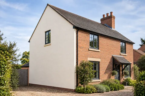
Window frames, roof tiles, brickwork, stone and door colours all influence how the render is perceived. Put the sample where at least some of those relationships can be seen. A colour that seems neutral against a white sheet may look warmer or cooler beside existing red or brown masonry. That is an appearance judgement, not a reason to claim that one shade is objectively correct for every house.
If windows or doors are also being replaced, use the intended finish samples rather than judging only against components that will soon disappear. Keep the proposed combination together. The house-rendering guide explains why the whole exterior needs a coordinated view. A sequence of individually approved choices can still produce an unexpected result if nobody assesses how they sit alongside one another.
Compare direct light with diffuse light
Look at the sample in sunlight and again when the light is diffuse or the wall is shaded. Avoid judging it only at a time when the facade receives unusually warm evening light. A broad comparison gives a better sense of the normal range of appearance. It does not guarantee that the wall will look identical in every condition; no exterior material does.
Texture can become more visible when light crosses the surface at a low angle. View the sample from the side as well as straight on. This is particularly useful for a narrow passage or a gable seen obliquely from the street. The side-wall article discusses those viewing conditions alongside access and edge details.

| Stage | Decision |
|---|---|
| Confirm product and grain | The sample represents the proposed finish |
| View beside retained materials | The colour relationship is acceptable |
| Compare sun, shade and distance | The normal range of appearance is understood |
| Record product reference | Ordering and approval use the same specification |
Step back to the normal viewing distance
A sample is usually examined much more closely than a completed elevation. Look at it from where the house is normally seen: the path, drive or opposite side of the street where it is safe to stand. Ask whether the chosen grain and colour support the intended appearance at that distance. Fine differences visible with your face close to the panel may have little effect on the overall facade.
The reverse can also happen. A colour that seems subtle on a small sample may be prominent across a large uninterrupted wall. A digital visualisation can help explore the scale of a colour change, but it still relies on a representative image and display. Treat it as a design aid, not a substitute for the physical material or an exact prediction of the finished colour.
Include the edges and trim in the decision
Profiles, window surrounds and a contrasting lower band can change the apparent balance of a facade. Decide whether those elements are retained, replaced or coloured differently. The sample approval should not silently cover only the broad wall while leaving visible trim to an unrelated later choice. Where existing details are protected or need to remain legible, the proposed finish must respect those requirements.
For an individual elevation, consider how the new colour meets the retained side wall or adjoining property. A slight difference may be acceptable at a corner but more obvious across one continuous face. Our wall rendering page covers that extent decision. The aim is to understand the likely join before work begins rather than discovering that the sample was approved in a location unrelated to the final boundary.
Patches need a realistic appearance discussion
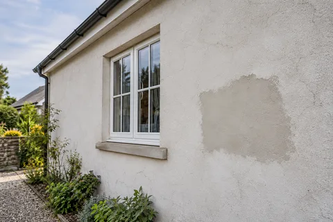
Matching a repair involves more than selecting the nearest colour code. The existing surface may have weathered or been coated, and its texture may be difficult to reproduce. A trial can show whether the repair is likely to remain noticeable. It should not be used to promise that every patch will disappear under all lighting conditions.
The repair guide separates the technical repair area from an optional larger finish area chosen for appearance. If recolouring is proposed after repairs, it may unify the tone without removing changes in relief. Examine the repaired sample in raking light where appropriate. A patch that looks close in a flat photograph may still create a visible shadow on the wall.
Record the approved material unambiguously
Keep the manufacturer's product name, colour reference and grain or texture designation. Note where the sample was viewed and whether it represents the complete intended finish. If more than one person has authority to approve the work, establish whose decision is final. A later conversation should not have to reconstruct whether “the lighter sample” meant the first panel or the one photographed in brighter light.
Photographs are useful as a supporting record, particularly if the sample cannot remain in place. Include the written reference in the file name or accompanying note. The photograph limitations guide explains why the image alone is unreliable for colour matching. Keep the physical sample where practicable and confirm the ordered material against the approved specification.
Know when a changed specification needs a new approval
If the product, texture or decorative treatment changes, consider whether the original sample still represents the proposal. A substitute described as similar may have a visibly different grain or sheen. Ask the contractor or supplier to explain the difference and provide an appropriate comparison. Do not assume an old approval covers a materially different finish simply because the colour name is close.
The same principle applies if the project changes from render-only work to an insulated system with different details. The final appearance includes more than the surface colour: deeper reveals, profiles and altered sills may affect the elevation. Review the complete proposal rather than approving each change in isolation and hoping the earlier sample still answers every appearance question.
Make the decision once the important comparisons are visible
You do not need endless samples to make a sound choice. Narrow the range to suitable options, compare them in representative positions and record the selected specification. If two finishes remain close, identify the specific preference that separates them, such as grain or the relationship with retained brick. That is more useful than repeatedly changing the shade based on photographs taken under different conditions.
The Carlton homepage links the available rendering, repair and coating routes. Use those pages to establish the work first, then make the appearance decision with a representative sample. The result should be an informed approval of a real material on your building, with enough documentation that the installer and owner are referring to the same finish when the project proceeds.
Common questions
Why does the same sample look different on two phones?
Camera processing, screens and surrounding light can change its apparent colour. Use images to support the discussion, then approve the physical material where practicable. Keep the manufacturer's reference so the order does not depend on a screen image.
Do I need another sample if only the grain changes?
A changed texture can alter the apparent colour and surface relief. Review a representative sample of the revised proposal rather than assuming the earlier approval covers it. The significance of the change should be explained before material is ordered.
See housing and planning information for Carlton and nearby places, including the source and geography behind each figure.